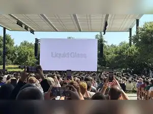
Apple has officially given iOS a dramatic facelift with the unveiling of its new “Liquid Glass” design at WWDC 2025. Billed as the centerpiece of iOS 26, this futuristic interface brings a bold, translucent aesthetic that dynamically adapts to its surroundings. Apple claims the design was developed using a “translucent material that reflects and refracts its environment” to create a fluid experience that draws focus to content.
Alan Dye, Apple’s Vice President of Liquid Glass, described iOS 26 as the company’s “largest software design update to date.” He emphasized how the Liquid Glass UI combines the visual depth of real glass with Apple’s signature smoothness, resulting in a user interface that changes based on content, context, and ambient light conditions. According to Apple, this not only enhances readability but also makes apps and interactions feel more alive and immersive.
The design has sparked a whirlwind of reactions across the internet—ranging from awe to confusion. While many users applauded its sleek and modern look, others criticized it for prioritizing form over functionality. “The new Liquid Glass UI looks cool but makes basic readability a challenge,” one user commented on X. Critics argue that Apple may be sacrificing practicality for aesthetics, especially in low-light or cluttered environments.
Despite the mixed reception, the design has undeniably captured global attention, triggering a wave of memes and social media debates. Some tech enthusiasts expected more focus on AI upgrades following last year’s WWDC announcements and felt the design shift was underwhelming. Still, Apple’s bold move has set the stage for a new visual era in mobile UI—and it’s one that people won’t stop talking about anytime soon.